 Storm: detail Taking good photographs of art quilts can be challenging, but with a little practise, good lighting and a tripod for the camera / phone it can be a manageable task. Over time I have learned how to take photographs of my work that are good enough for things like books, catalogues, exhibition submissions, magazine articles etc. As much of my work is now 3 dimensional I have needed to think carefully about how best to show it. Some pieces hang as flat planes, others sit on a plinth, whilst others are repositionable; all appear differently, depending on the viewers position. This has led me to explore how video can be used to capture images of the pieces in addition to straight forward photography. This week, using still images of my art quilt 'Storm' I made a new video. I use a web based creator called Biteable (www.biteable.com) and I enjoy the process of bringing together different images to create short 1 minute videos which allow the work to be viewed from many different angles. It is also possible to add music to these videos which contributes another interesting element to each piece. Creating the videos is not a quick process, but I find it a very satisfying and I feel it completes each piece of work well. Fortunately, the online creation process is fairly straightforward: I collect together a selection of photos, correct the colour and crop each to a desirable size. I try to keep the images as large as possible to allow zooming within the video - a nice feature that is not possible with a still photos. Next I sequence the photos and source an appropriate piece of music to accompany the images. The choice of music is an incredibly important part of the video as I want it to reinforce the concept of the piece. Copyright and licensing are also important factors to consider when selecting a suitable piece of music. To this end I have a question - which of the two soundtrack options below do you think works best for this piece? The first video below (calm) has a very different mood to the second (dramatic), although the images are exactly the same. I like them both, and I do have a favourite, but I am interested to know which you would choose.
The next piece of news I have is that I have recently been interviewed by Chardel and Lynne from CreateWhimsy.com and last week I was one of their featured artists. You can read it, and many other fabulous interviews and articles about all kinds of creativity on their website, createwhimsy.com. I hope you enjoy taking a look at all the fantastic work and ideas you can find there - there is a lot to discover and they also have a signup page where you can get email notifications when they publish something new. My spotlight page on CreateWhimsy can be found by clicking the link below. https://createwhimsy.com/projects/spotlight-claire-passmore-textile-artist/ Keep well and thanks for reading.
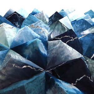
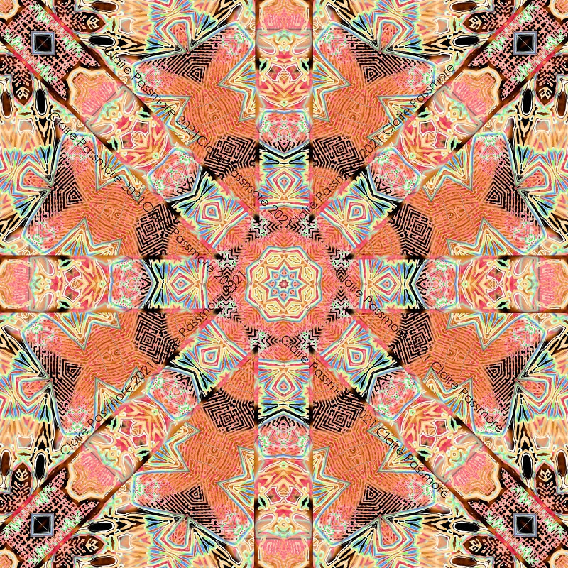
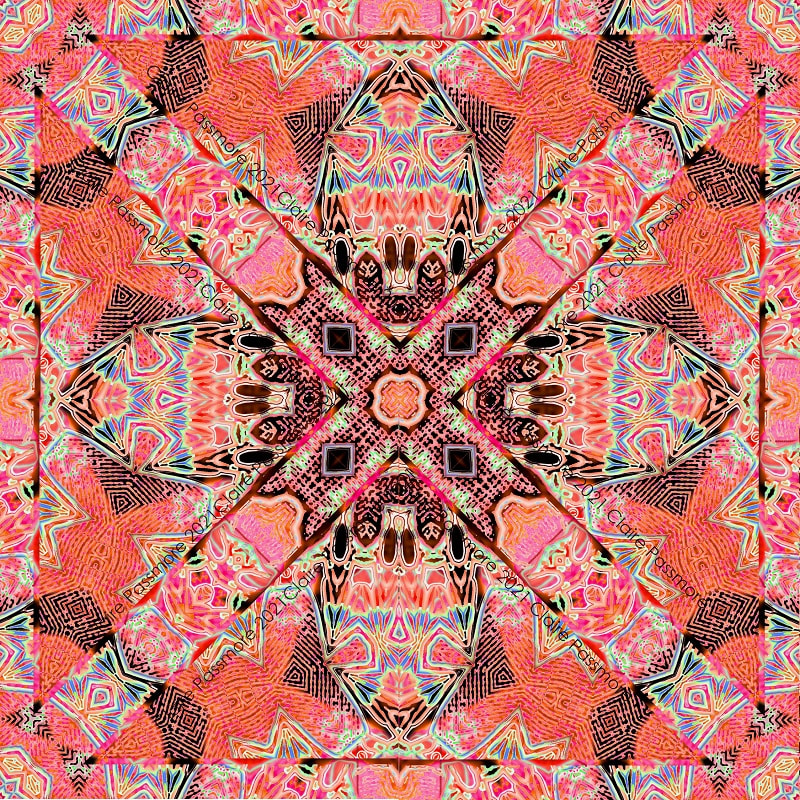
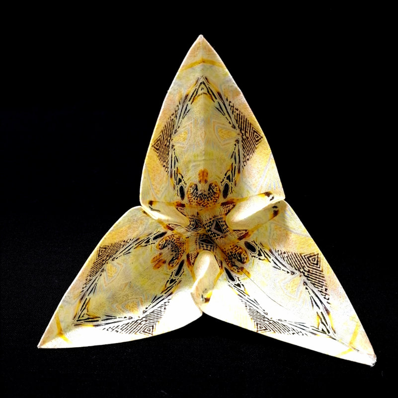
 'Metamorphosis' (work in progress) Claire Passmore ©2021 Lately I have been thinking about the different ways I can add colour and surface design to the fabric I use for my 3D pieces. Mostly I use dye, lino prints with ink and stitch and am very happy with the bold results. For the next piece in this series I wanted to explore adding much more detail to the fabric surface, so I turned to my home printer. I dabbled with printing on fabric with my home printer a long time ago when I printed the lighthouse at Cape Point, South Africa, onto fabric for a quilt called 'Storm@Cape Point'. It worked well and I was very pleased with it at the time.  Storm @ Cape Point (detail) Claire Passmore ©2014 Back then there was a product called Bubble Jet Set which was recommended for pre treating fabric, prior to passing it through the printer. Unfortunately I could not get hold of any, so I turned to the internet to discover a home-made version. I tried several different recipes and the method I found most successful used alum - and as I recall, was a very messy experience. However, it did the job and the printed photo still looks good today, 7 years later. A lot of progress has been made in printing on fabric since then, with many large commercial online printers offering large format print on demand services by post. I have tried a few and been reasonable happy with the results, but I like the ability to print a sample, play about with it, print another and so on, which doesn't really work well when you have to wait a week or so for the fabric to be delivered. So I went back to the DIY method and searched for a product to coat the fabric with at home. These days the 'go to' product seems to be a coating made by a company called inkAID. Their website describes it as 'inkAID Inkjet Receptive Coatings allow you to create fine art digital and mixed media inkjet prints on an almost infinite variety of materials' and I can say with confidence, it works really well. Once again, it is messy, but in my opinion, the results are worth it. Here is a link to the manufacturer's website: https://inkaid1.com/ Having decided to print my own design onto the fabric I obviously needed an image. I could have chosen a photograph or a scanned image, but I thought it would be fun to try something a different - so I took a photo of one of my 3D quilts and set to work manipulating it with image editing software (I always use GIMP) and the 'kaleidoscope' filter it has. I have a thing for kaleidoscopes, so this was a lot of fun. This is the image I started with............  'Nocturnal Glow' (detail) Claire Passmore ©2021 You can see more images of this quilt and others in this series in the gallery on my website, or by clicking here Using the kaleidoscope filter and transforming different layers, I ended up selecting 2 different designs to print onto fabric - I am sure you will agree, you would never tell that they came from the source image.
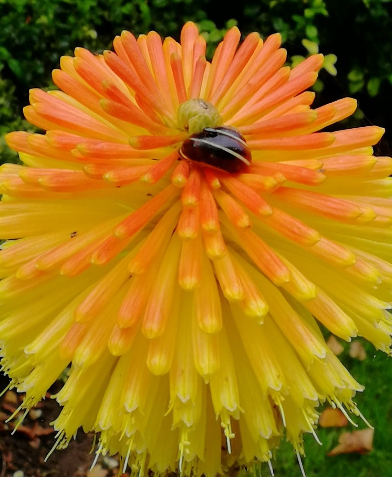
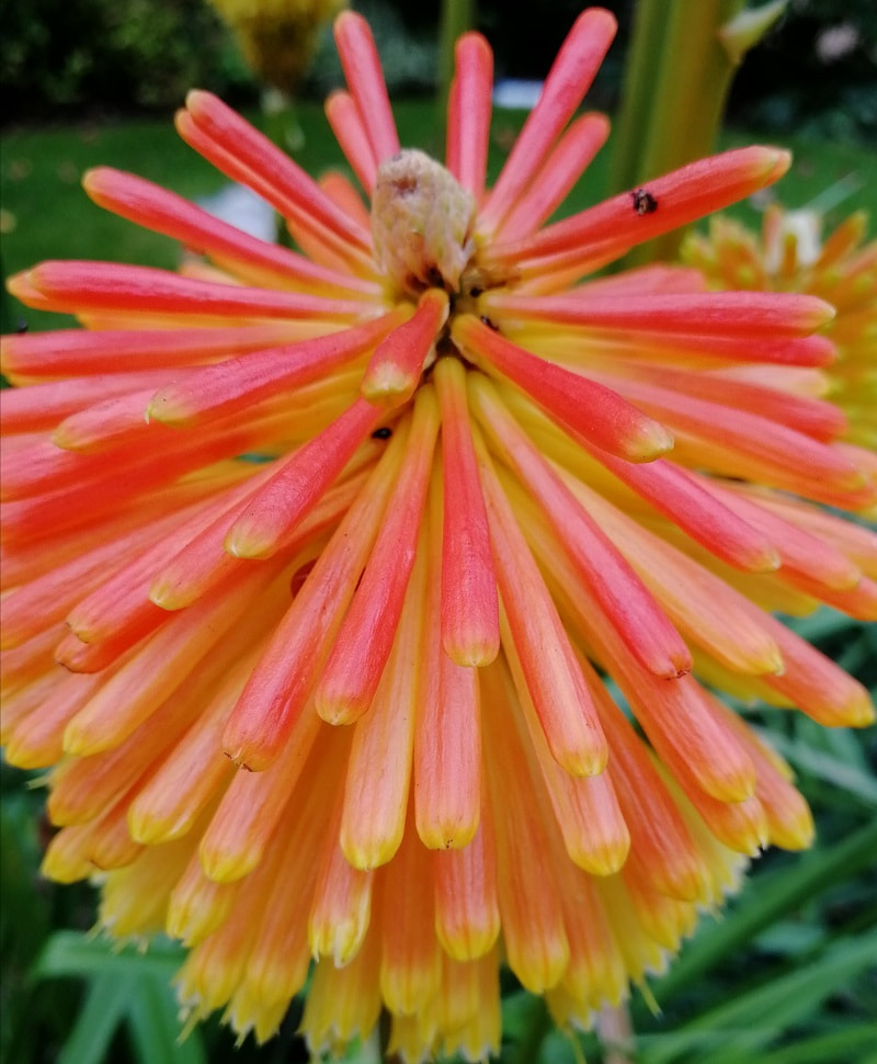
The colour palette for these squares was inspired by these beautiful Red Hot Poker flowers (Kniphofia) that were in bloom in the garden. Aren't they spectacular? The snails absolutely loved them too!
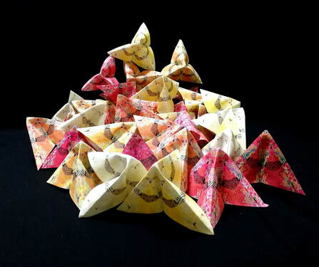
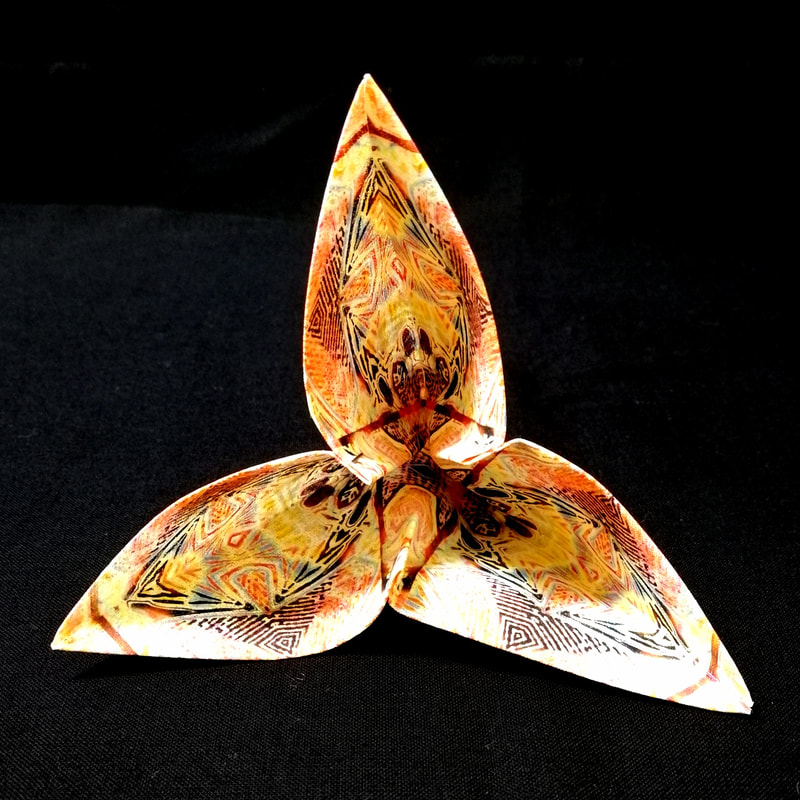
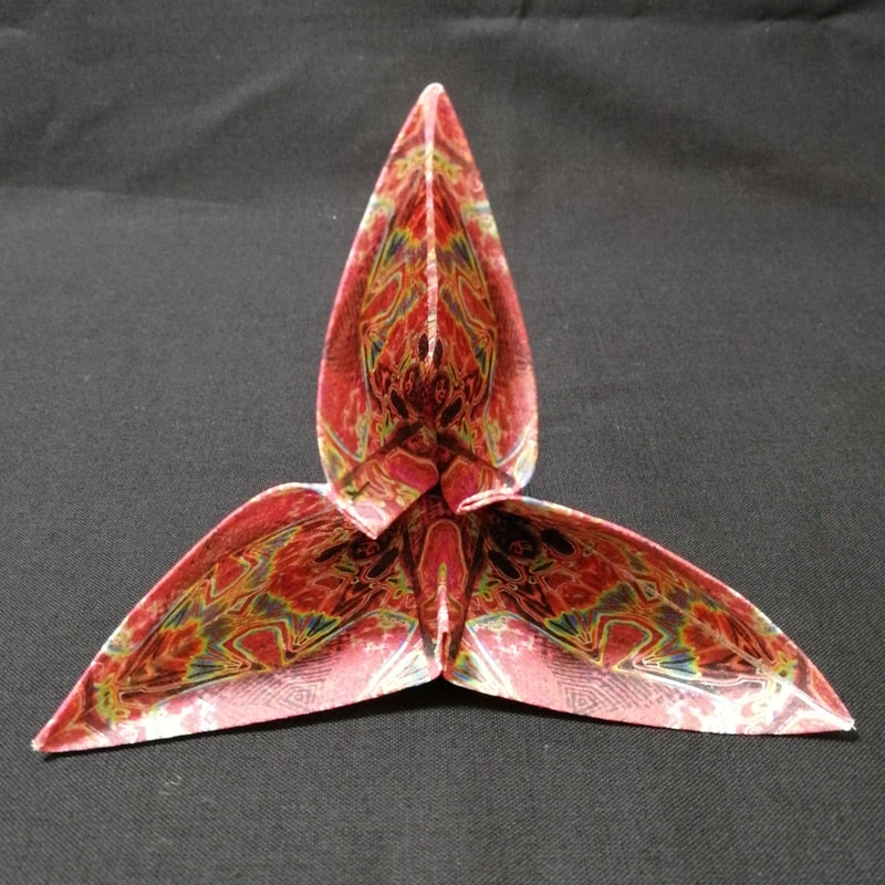
Printing the squares took the best part of 3 days, as the medium had to be painted onto the fabric and left to dry before cutting into sheets to feed through the printer. Putting it through the printer also took quite a time as great take care needs to be taken to trim the fabric so it has no loose threads or wonky edges. I did manage to mangle a few pieces and the printer did make a some very horrible noises, but overall is was a manageable job and the results were excellent. The next part of the process was to trim and fold the squares into their modified pyramid shape. I always enjoy folding them, watching the stack grow bigger and bigger. Here are a few of the different colours. An added bonus of folding in this way is that there is decoration on all surfaces, inside and out which will mean that the final piece is dual sided.
Once I had a nice big pile I joined them by their tips to create a lattice structure. 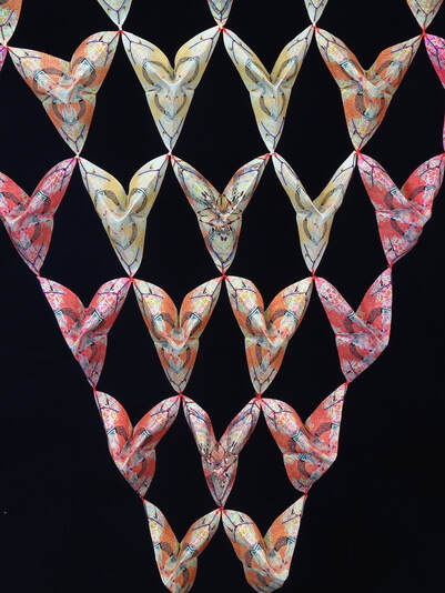 Metamorphosis (front detail) Claire Passmore 2021 You can see the finished piece by visiting the gallery on my website, where you will also find other pieces in this series. Click here to view the gallery. I have decided to call it 'Metamorphosis' and I hope you enjoyed finding out a little more about it. I have submitted it for consideration to be exhibited next year - so am crossing my fingers! Thanks for reading. Keep well.
|
|


 RSS Feed
|
Copyright © 2011 to 2024 Claire Passmore. All rights reserved No artwork on this site may be reproduced, copied or stored without the express permission of Claire Passmore |

|