|
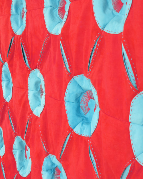
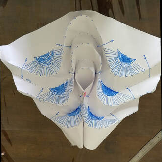
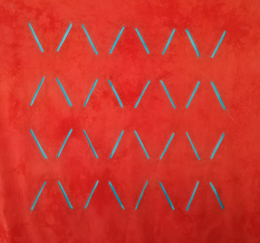
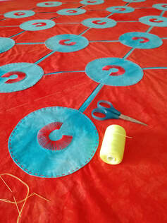
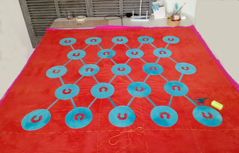
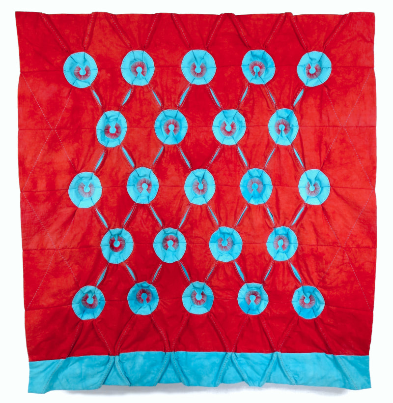
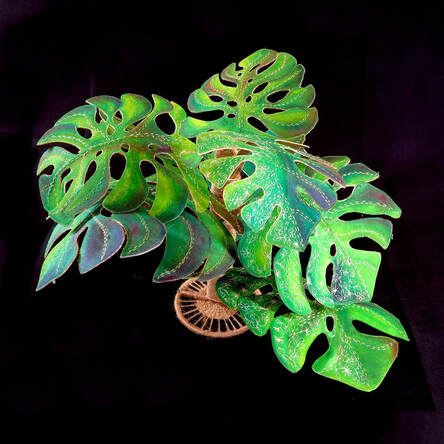
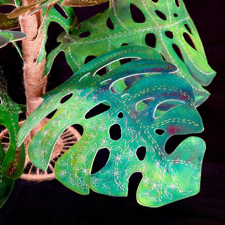
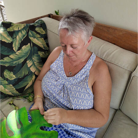
For the past 4 months or so I have been working to develop a new direction for the wall hung quilts I make. I love the sculptural effects that can be achieved with fabric, so my new aim is to create a collection of art quilts that make the most of this. I want to make quilts with sculpted surfaces. Learning how to do this needs samples, lot of samples. I've been using paper, felt and cloth to understand how lines can become edge and surfaces transformed into volumes. I always love the exploratory phase of any project - in fact I think I may even enjoy this more than the hard work of creating a finished piece. Exploring is so much more liberating! The only trouble is, there is seldom very much to physically show for it, except a heap of contorted paper. But, I have learned a lot about how to form and control pleats, gathers and tucks, and what combining these structural elements can do to the surface of a quilt. Eventually though, there comes a time to stop sampling and get going! The red quilt at the top of the post is called 'in-Tension', and is the first full sized sculpted quilt I've made. It took a long time to make! I deliberately limited myself to 2 super saturated colours which really vibrate together, and 2 simple shapes. I wanted to emphasize the contoured surface to the max, so there is no other detail. The construction stitches double up as the quilting and I used dressmaking techniques to gather specific points together and created giant buttonhole type slashes which later became he dips and ridges created pleats. I absolutely loved making this quilt - it was a challenge right from the start and I really like the concept. Creating the quilt top was straightforward, but there are still issues I need to resolve to better control the overall finish. This is how it currently looks.... but further refinement is nescessary. I am presently working on 2 further pieces that continue this concept. I'll post more about them soon. Thanks for reading. Beautiful Monster is the new 3D sculpture I recently finished and was a lot of fun to make. It measures 16" x 23.5" x 23.5" (40cm x 60cm x 60cm) Everything on the island of Mauritius seems to grow to enormous proportions, even the snails are enormous! The fertile volcanic soil, the plentiful rains and the clean, unpolluted air provide the perfect environment for everything to grow and grow. This beautiful monster is an interpretation of the Monstera plant that is taking over my garden. Made from layers of painted heavyweight interfacing that are stitched together then cut into large leaf shapes. The holey leave are such nice shapes to work with and seem to curve naturally. The support is made from a metal frame which is wrapped with hemp cord. Large pieces of interfacing were painted with diluted acrylic paint. Yellow, blue and black paint in varying quantities give all kinds of shades of green. A little red added to the mix provided some nice variation and depth. On the underside of the leaves I decided to add a little luxury, so covered the surface with gold leaf. It was a very messy process, but adds just a hint of a warm glow to the reflected light. I like it! I hand stitched the leaves with a combination of perle thread, stranded embroidery cotton and also added some free motion stitched embroidery in a delicate lacy pattern over part of the surface. The individual leaves slide onto the support and can be positioned in many ways so as to give quite a lot of variation. Here are a few more views. Thanks for reading!
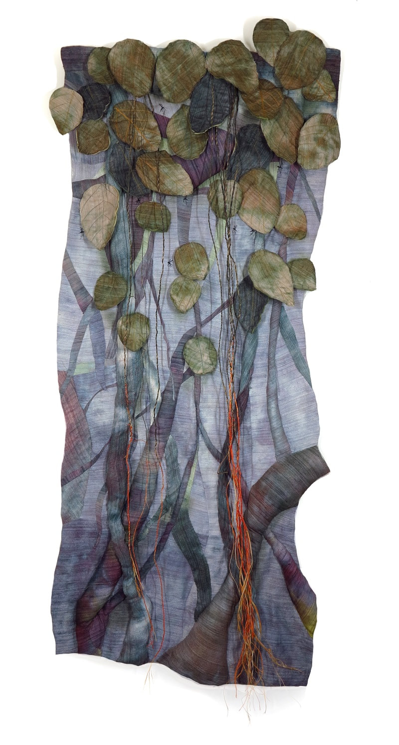
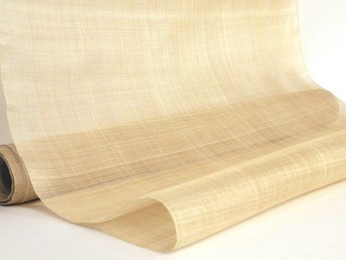
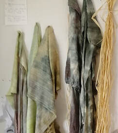
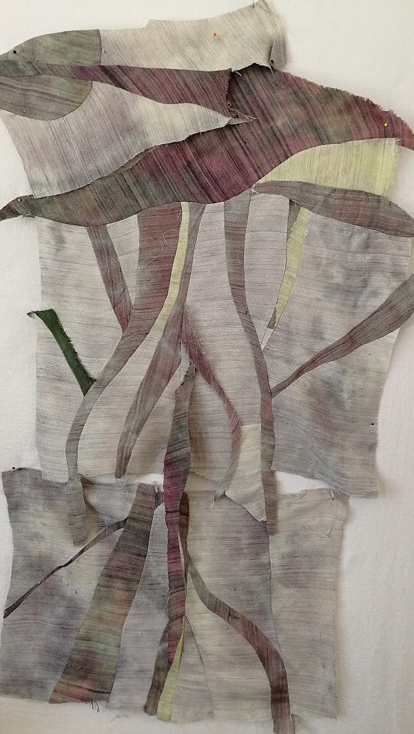
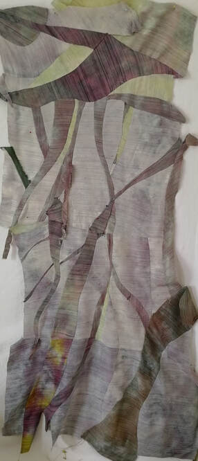
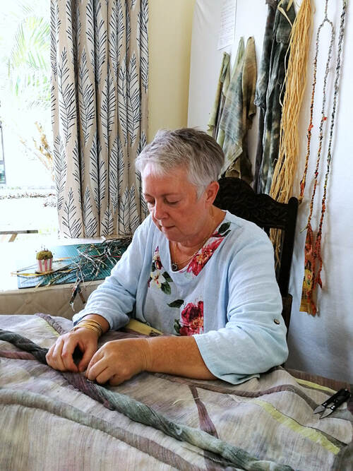
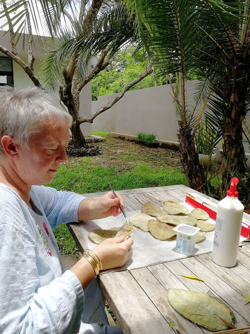
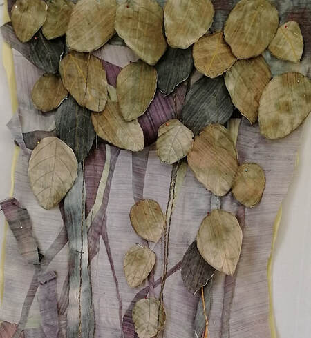
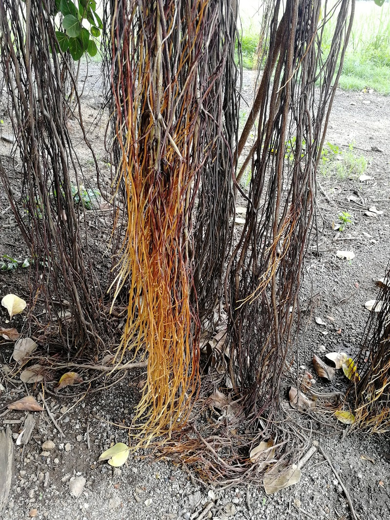
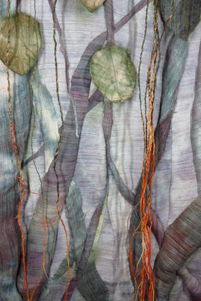
I am happily settled in my new home and have been able to finish my first new piece of the year, which I've called 'Banyan Hideaway. Before I was able to get started I needed to buy supplies as I brought minimal tools with me. I really didn't want to needlessly transport lots of tools or materials half way around the world and am looking forward to finding new materials to work with. I am determined to make use of what I can locally sourced and am reluctant to import tools or materials unless I absolutely, desperately need them. One of my first finds here has been banana fabric, also known as banana silk or musa fibre. It is made from the soft inner lining of banana peels or the pseudo stem of the banana plant. Just like hemp, which produces a flowering and a stem section, banana stems and peels yield fibers that can be made into textile products. This practice has actually been going on for many centuries, but it’s only now that I have ever come across this beautiful fabric. As a natural fiber, banana fabric is also in a special category in terms of sustainability as it is derived from what would otherwise be a waste product. It was my guess that this fabric would dye well with fibre reactive dyes, but I wasn't sure how well. The fabric I bought was a beautiful natural pale creamy colour and I was more than happy with the results. Rather than the obvious, I decided to use this newly discovered fabric to make my interpretation of a different tree, one that I pass almost everyday; it is one of the most impressive specimins I have ever seen - a Banyan tree. You can read more about these trees here... https://en.wikipedia.org/wiki/Banyan Starting with squares of fabric I freely cut and pieced some curved shapes to give the impression of long aerial roots. I was quite random to begin with then gradually joined sections together and inserted further pieces to create a flat background. I added more aeriel roots, stitching loose pieces onto the quilt surface and filling the voids with wadding to add depth and dimension. To make sure the leaves were the correct shape I collected several specimens from the ground beneath the tree and used them as templates to cut leaf shapes from the banana fabric. The fabric is beautifully soft but not stiff enough to hold its own weight and frays very easily, so I stitched a layer of felt behind to give each one enough body to stand proud of the surface of the quilt. After stitching the layers together I used diluted PVA glue to seal the edges of the banana silk to stop any further fraying. Once dried the leaves were pinned in place and I discovered I needed a lot more! With the leaves stitched on, the last elements to add were the very thin vine-like roots. They are such a vibrant colour when compared to the rest of the tree. I used natural raffia which I found at the fruit and vegetable market, which also dyed very well. The finished quilt measures 60" x 24" x 3", or 152cm x 61cm x 7.5cm One further thing to talk about in this blog post is a question that I was asked last week by Ryan Castillo from Redfin (Redfin.com). He wrote to me and asked "Do you put your own art on the walls of your own home?" Good question.... and actually, I don't because the art quilts I make are usually too large to hang on my walls - the scale is just wrong (which got me thinking!) His follow up question was then - "so what do you put on your walls, and how did you choose it?"
You can read more about how I other artists answered that question in his blog post here www.redfin.com/blog/art-pieces-for-every-room/ Thanks for reading! Keep well, Taking good photographs of art quilts can be challenging, but with a little practise, good lighting and a tripod for the camera / phone it can be a manageable task. Over time I have learned how to take photographs of my work that are good enough for things like books, catalogues, exhibition submissions, magazine articles etc. As much of my work is now 3 dimensional I have needed to think carefully about how best to show it. Some pieces hang as flat planes, others sit on a plinth, whilst others are repositionable; all appear differently, depending on the viewers position. This has led me to explore how video can be used to capture images of the pieces in addition to straight forward photography. This week, using still images of my art quilt 'Storm' I made a new video. I use a web based creator called Biteable (www.biteable.com) and I enjoy the process of bringing together different images to create short 1 minute videos which allow the work to be viewed from many different angles. It is also possible to add music to these videos which contributes another interesting element to each piece. Creating the videos is not a quick process, but I find it a very satisfying and I feel it completes each piece of work well. Fortunately, the online creation process is fairly straightforward: I collect together a selection of photos, correct the colour and crop each to a desirable size. I try to keep the images as large as possible to allow zooming within the video - a nice feature that is not possible with a still photos. Next I sequence the photos and source an appropriate piece of music to accompany the images. The choice of music is an incredibly important part of the video as I want it to reinforce the concept of the piece. Copyright and licensing are also important factors to consider when selecting a suitable piece of music. To this end I have a question - which of the two soundtrack options below do you think works best for this piece? The first video below (calm) has a very different mood to the second (dramatic), although the images are exactly the same. I like them both, and I do have a favourite, but I am interested to know which you would choose. The next piece of news I have is that I have recently been interviewed by Chardel and Lynne from CreateWhimsy.com and last week I was one of their featured artists. You can read it, and many other fabulous interviews and articles about all kinds of creativity on their website, createwhimsy.com. I hope you enjoy taking a look at all the fantastic work and ideas you can find there - there is a lot to discover and they also have a signup page where you can get email notifications when they publish something new. My spotlight page on CreateWhimsy can be found by clicking the link below. https://createwhimsy.com/projects/spotlight-claire-passmore-textile-artist/ Keep well and thanks for reading.
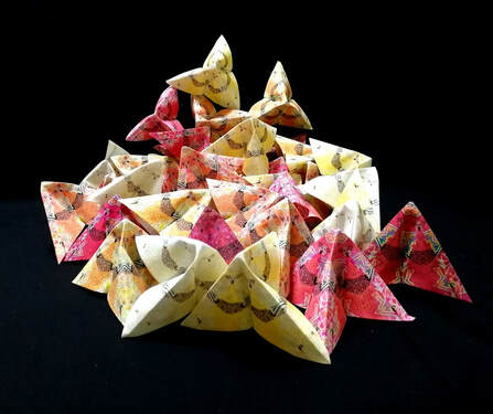
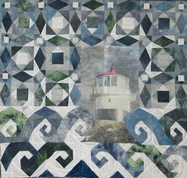
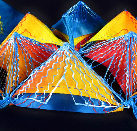
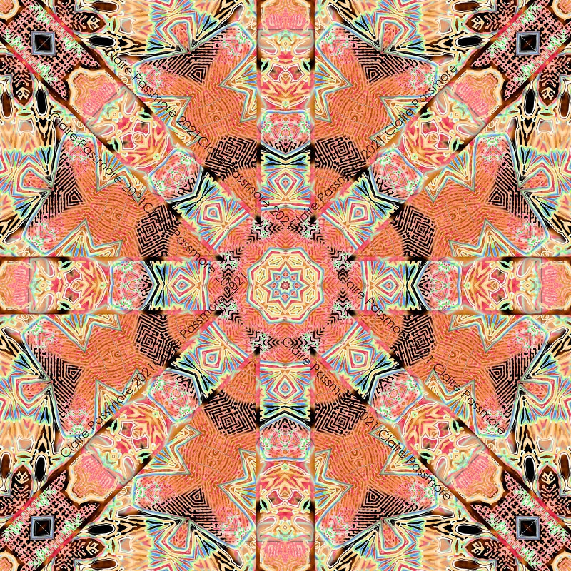
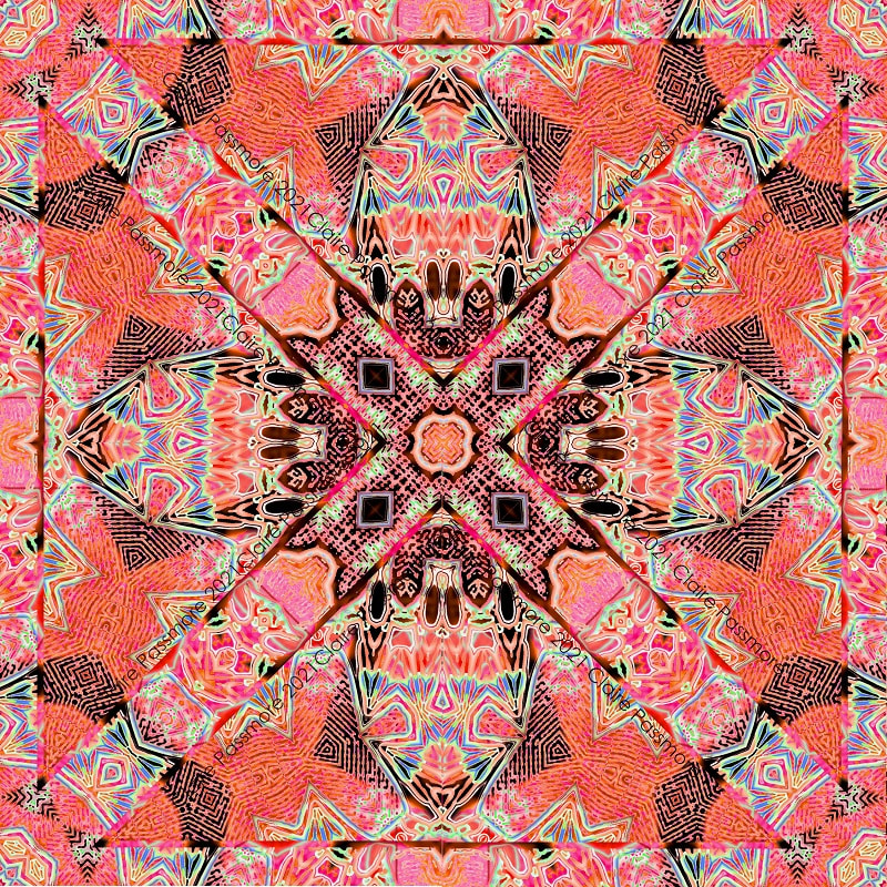
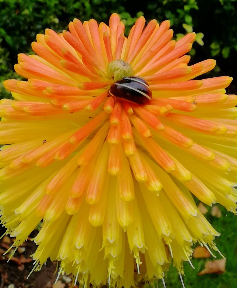
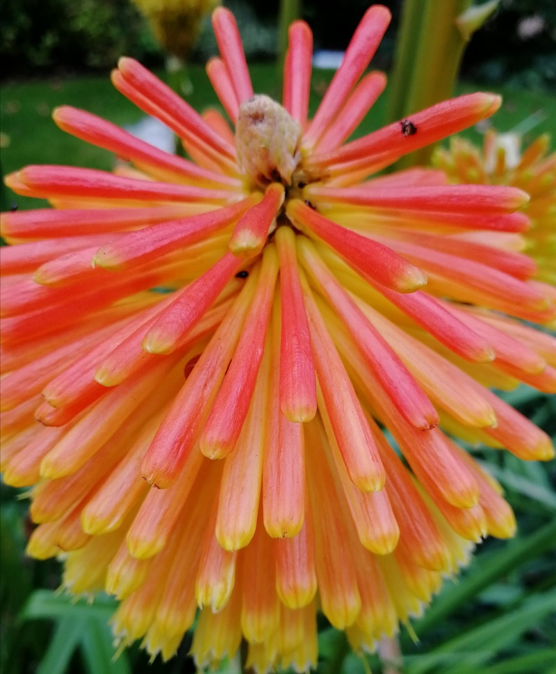
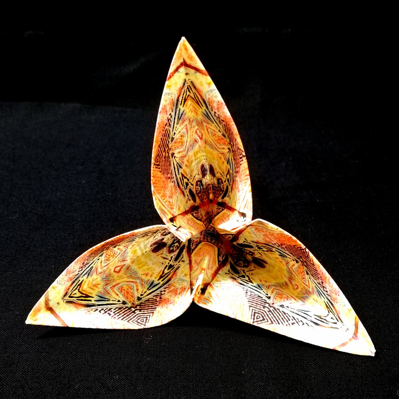
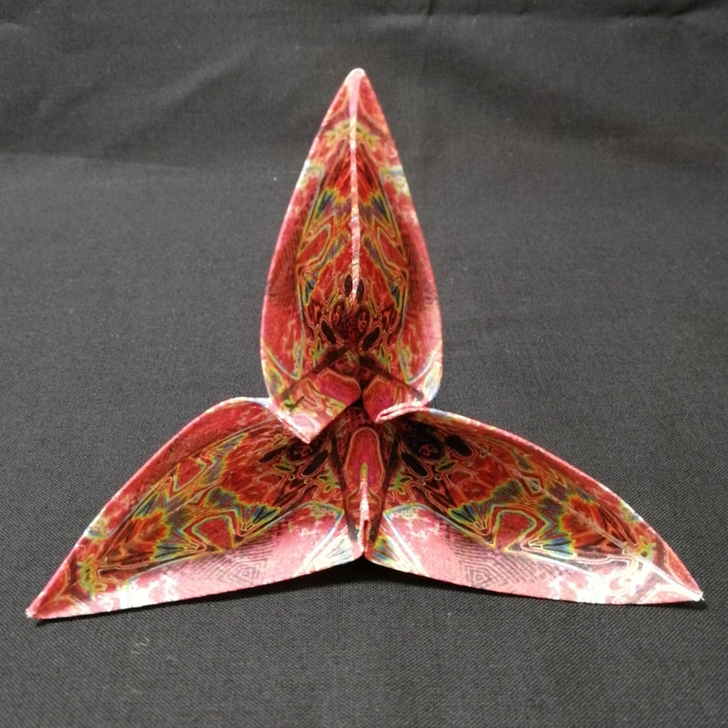
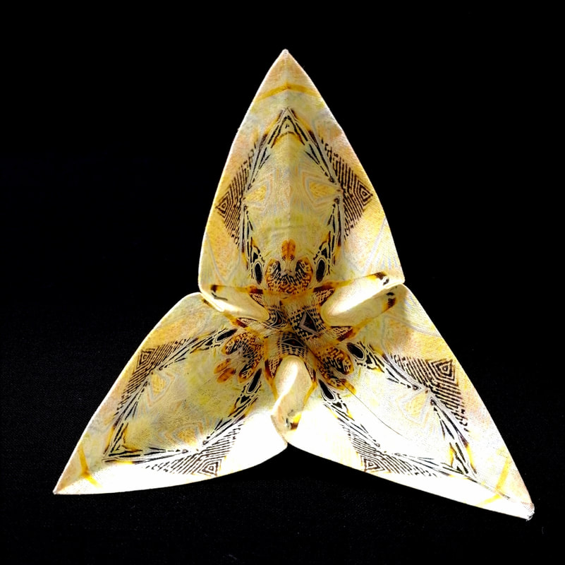
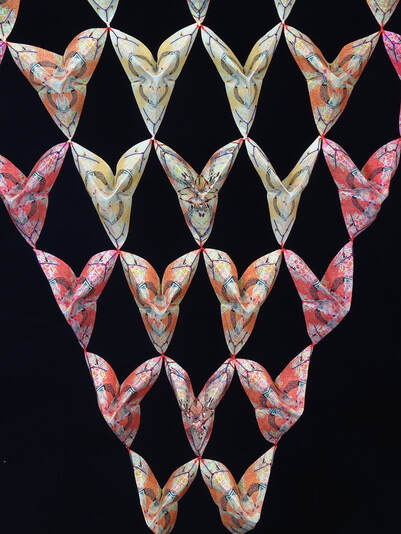
Lately I have been thinking about the different ways I can add colour and surface design to the fabric I use for my 3D pieces. Mostly I use dye, lino prints with ink and stitch and am very happy with the bold results. For the next piece in this series I wanted to explore adding much more detail to the fabric surface, so I turned to my home printer. I dabbled with printing on fabric with my home printer a long time ago when I printed the lighthouse at Cape Point, South Africa, onto fabric for a quilt called 'Storm@Cape Point'. It worked well and I was very pleased with it at the time. Back then there was a product called Bubble Jet Set which was recommended for pre treating fabric, prior to passing it through the printer. Unfortunately I could not get hold of any, so I turned to the internet to discover a home-made version. I tried several different recipes and the method I found most successful used alum - and as I recall, was a very messy experience. However, it did the job and the printed photo still looks good today, 7 years later. A lot of progress has been made in printing on fabric since then, with many large commercial online printers offering large format print on demand services by post. I have tried a few and been reasonable happy with the results, but I like the ability to print a sample, play about with it, print another and so on, which doesn't really work well when you have to wait a week or so for the fabric to be delivered. So I went back to the DIY method and searched for a product to coat the fabric with at home. These days the 'go to' product seems to be a coating made by a company called inkAID. Their website describes it as 'inkAID Inkjet Receptive Coatings allow you to create fine art digital and mixed media inkjet prints on an almost infinite variety of materials' and I can say with confidence, it works really well. Once again, it is messy, but in my opinion, the results are worth it. Here is a link to the manufacturer's website: https://inkaid1.com/ Having decided to print my own design onto the fabric I obviously needed an image. I could have chosen a photograph or a scanned image, but I thought it would be fun to try something a different - so I took a photo of one of my 3D quilts and set to work manipulating it with image editing software (I always use GIMP) and the 'kaleidoscope' filter it has. I have a thing for kaleidoscopes, so this was a lot of fun. This is the image I started with............ You can see more images of this quilt and others in this series in the gallery on my website, or by clicking here Using the kaleidoscope filter and transforming different layers, I ended up selecting 2 different designs to print onto fabric - I am sure you will agree, you would never tell that they came from the source image. The colour palette for these squares was inspired by these beautiful Red Hot Poker flowers (Kniphofia) that were in bloom in the garden. Aren't they spectacular? The snails absolutely loved them too! Printing the squares took the best part of 3 days, as the medium had to be painted onto the fabric and left to dry before cutting into sheets to feed through the printer. Putting it through the printer also took quite a time as great take care needs to be taken to trim the fabric so it has no loose threads or wonky edges. I did manage to mangle a few pieces and the printer did make a some very horrible noises, but overall is was a manageable job and the results were excellent. The next part of the process was to trim and fold the squares into their modified pyramid shape. I always enjoy folding them, watching the stack grow bigger and bigger. Here are a few of the different colours. An added bonus of folding in this way is that there is decoration on all surfaces, inside and out which will mean that the final piece is dual sided. Once I had a nice big pile I joined them by their tips to create a lattice structure. You can see the finished piece by visiting the gallery on my website, where you will also find other pieces in this series. Click here to view the gallery.
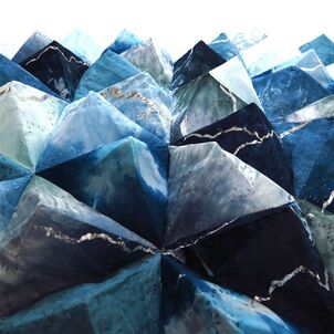
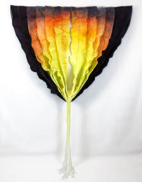
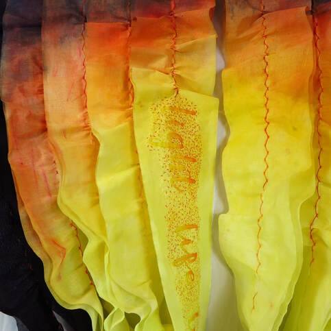
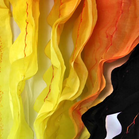
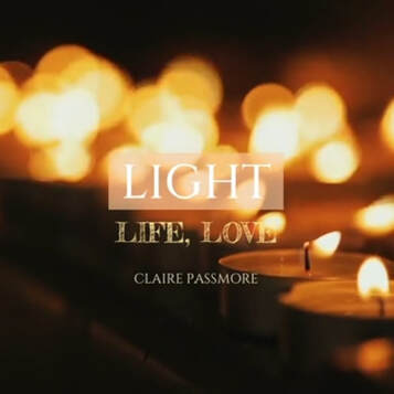
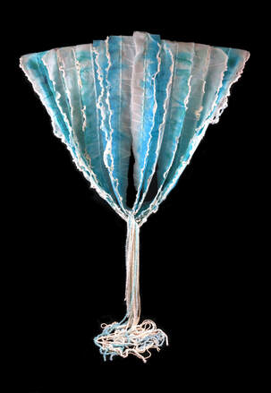
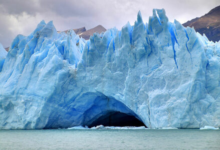
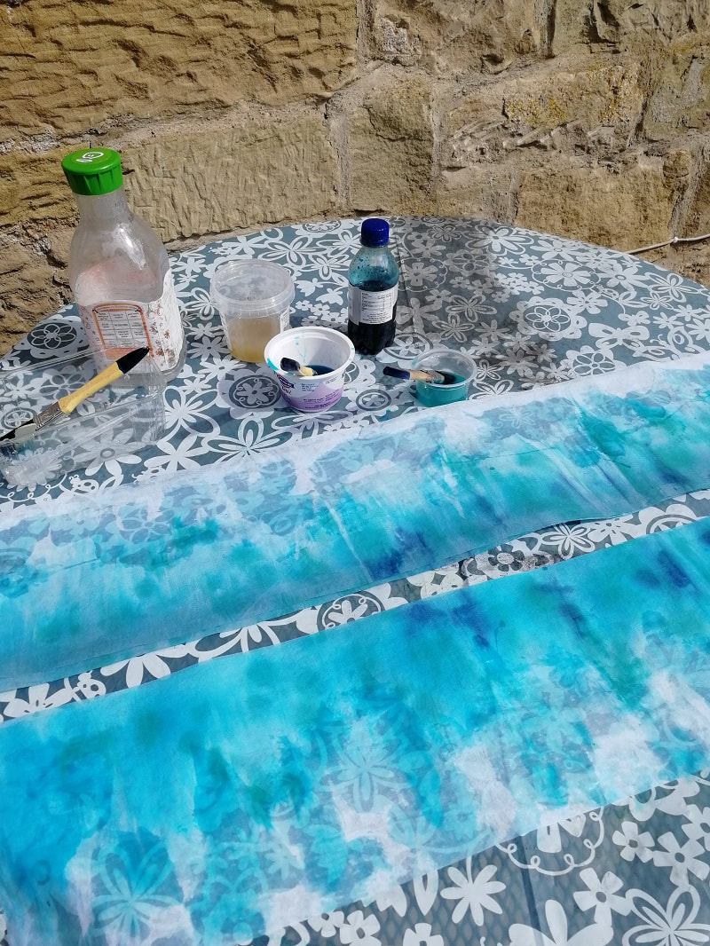
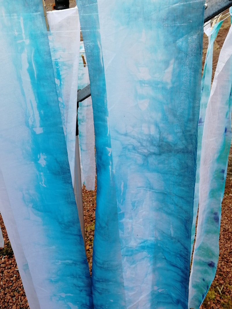
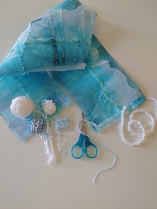
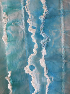
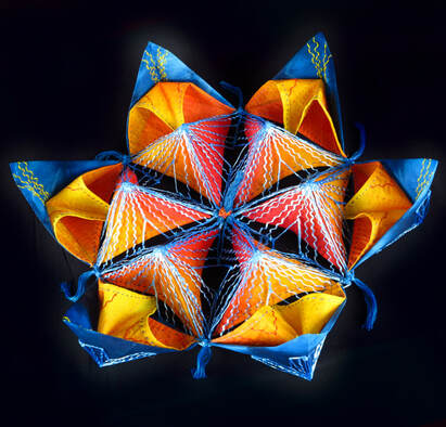
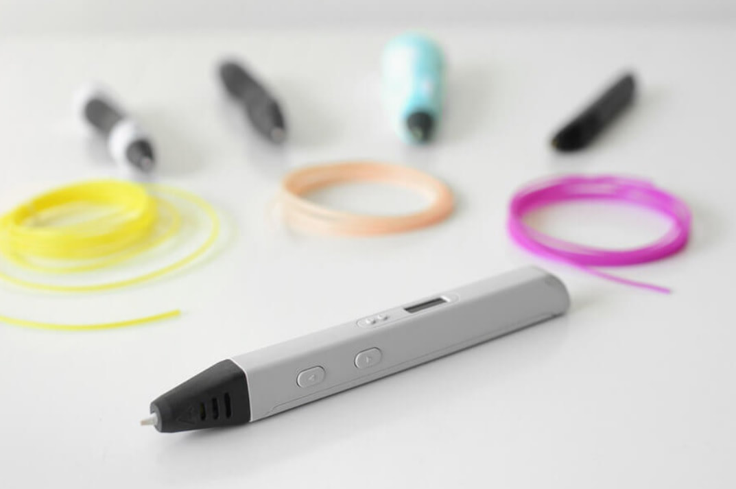
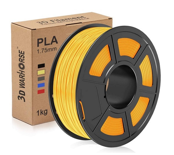
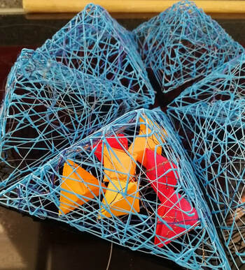
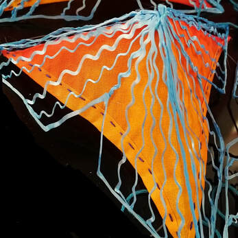
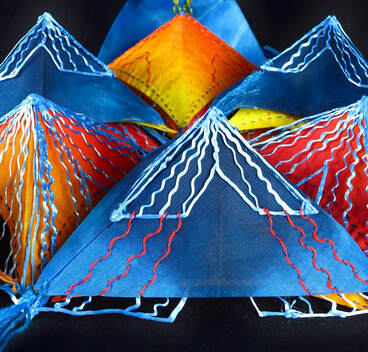
I have decided to call it 'Metamorphosis' and I hope you enjoyed finding out a little more about it. I have submitted it for consideration to be exhibited next year - so am crossing my fingers! Thanks for reading. Keep well. I have been waiting a long time to be able to show and write about this piece, and today I am happy to finally be able to do so. It is currently being exhibited at the 8th European Quilt Triennial (2021-2023) which opened today at the Textilsammlung Max Berk Kurpfalzisches Museum in Heidelberg Germany. I am delighted that after all the uncertainty we are currently living with the exhibition has been able to open and that I have a piece of my work in this prestigeous event. Congratulations to all the artists, Dr Kristine Scherer and everyone at the museum who have worked so hard to make the opening possible. https://www.museum-heidelberg.de/Museum-Heidelberg/startseite/ausstellungen/8_+Europaeische+Quilt-Triennale.html This piece is titled ' Light, Life, Love' and follows on from the earlier piece 'In Loving Memory', both of which have very personal significance. You can find them both in the gallery on my website here. It was made when the world was still gripped by the Covid-19 virus and there was little optimism to be felt, so I wanted to create a piece of work that felt uplifting. As with the previous piece I built on the emotions that can be roused by candle light, the gentle flame providing warmth, comfort and glimmers of hope. A glow that lifts our spirit and gives us the strength to look to the future and know there are better times to come. The quilt is made from long strips of intensely dyed cotton organdie which have been gently gathered into soft ripples. For me it represents the future and holds a message of life, light and love. Very recently it has also acquired an unexpected personal significance - this is for you mum. xxx Click the image below to view a short video of the piece. Thank you for reading. European Quilt Triennial dates and venues: 10 October 2021 to 16th January 2022: Textilsammlung Max Berk Kurpfalzisches Museum, Heidelberg Germany January to 24 April 2022: Kreismuseum Zons/Dormagen, Germany November 2022 - January 2023: Textile Museum St Gallen Switzerland I have been working on my latest piece for the past month and am relieved that is was finished just before the required deadline of August 31st. This is the third of these draped art quilts I have made and I am really beginning to better understand and enjoy the nature of creating work that has no definite form or end. Combining and stitching long strips of fabric and then allowing gravity to become part of the creative process means I have far less control over their final form. It is interesting to note that although each of the three pieces has started out with virtually the same component parts, they have each taken on their own passing form once hung. It also means that although I have taken a photograph of this piece - it will never look the same again, as next time it is suspended gravity will undoubtedly make it look a little different. The colour of glacial ice is a magical thing - we are used to pure water being colourless and snow and ice being white but glacial ice is a lot different from the stuff we get out of the freezer. This ice has been in situ for such long time that it has become ultra compacted, so much so that its crystaline structure absorbs all wavelengths of light except blue, which is strongly scattered by the ice crystals. In addition, glacier ice contains many air bubbles which become severely squeezed by the high pressures within the dense ice. These bubbles are not always round and can be squeezed into long rods, flat planes and can even move around within the solid ice. Because of these small bubbles some areas of the ice can also take on a coarse, bubbly appearancewith small bubbles, especially near the ablation areas of a glacier where evaporation or melting take place. In contrast, coarse clear ice is free of bubbles and is the bluest ice of all. This kind is usually found near the margins and terminus of a glacier. To capture these various colours I used turquoise and black dye and then added pleats, layers and stitch to add shadows and changes in value. For the whiter, coarser bubbly ice I explored crocheting a variety of recycled fibres - recycled jeans, dishcloths, merino wool and an unknown fibre from a garment I unravelled. To complete the piece I wound more than a kilometer of the same recycled fibres into cords to drop from the fabric swags to pool onto the ground. There are more images of this piece on my website www.clairepassmore.com/water.html - just scroll downwards). Alternatively, click below to view the video. Thanks for reading. Keep well. Hello again, This is a new piece that I have just finished which I hope will be going off to an event in Chicago in November. I have submitted it for consideration to the juror and am keeping my fingers and toes crossed that they will like it! It was really interesting to make as I was playing with some new gadgets - different types of 3D printers. I have been reading a lot about them recently and wanted to see what they could do and whether they would be a useful addition to my toolkit. As you can see, you can make some very cool-looking shapes! 3D printers use a filament that is melted and then extruded in layers from a print head to form whatever shape you wish to create. The printing process is done either by a 3D printing machine or more simply, a 3D printing pen. With a machine it is possible to print solid objects, such as a chess piece or a cup,for example. With the right kit incredibly large or complex objects can also be printed, such as prosthetic limbs and a team of researchers from the University of Maine have even printed a boat! You can read more about that here: www.3dnatives.com/en/3d-printed-boat-university-of-maine-161020195/#! Whilst a huge printer that can print a boat would have been fun, I decided to try out somehing a little simpler - a 3D print pen. Toy type pens are fairly cheap if you want to have a try, starting at around £20 or so. What I have discovered that they are very easy to use - but difficult to use well! The filament I chose to use is called PLA, which stands for polylactic acid. PLA is a vegetable-based plastic material, which commonly uses cornstarch as a raw material, so is therefore non-toxic and biodegradable. It comes in the form of wire filament on a spool, which is fed into the pen or printer where it is heated then extruded out of the pen tip / printer head and deposited in a continuously extruded thread. I did a lot of playing about to see how the pen works and after making a lot of blobs and lines I eventually made some small pyramid shaped cages. The PLA is surprisingly strong and it is possible to make pretty much any shapes you can think of, so there is a lot of potential. Using the same pyramid shape I also tried some other more delicate lines and produced another set of cages. The lines of PLA are much finer in this set so placing a fabric pyramid beneath the printed structure makes themmuch more visible. The complimentary colour makes for a very vibrant combination don't you think? From there I continued to add more pyramids and embroidery as you can see below. The luminoscity of the combination of colours I used meant it was easy to name this piece. I also had fun making a short video which shows the finished piece - I hope you enjoy looking at it. I hope you like it too - and maybe even think about trying out some new tools - it can lead to interesting and sometimes surprising results.
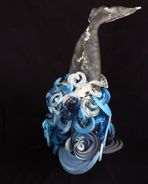
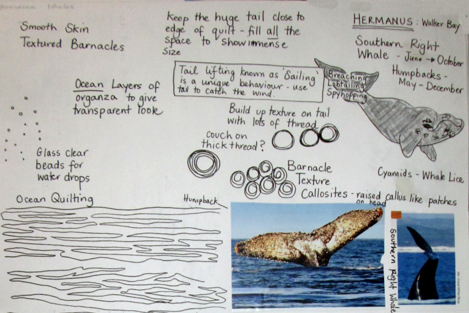
Keep well, You probably haven't noticed but from today my blog posts are now part of my website. Until now my blog was part of an old website I stopped using about 5 years ago - as my website provider has never been able to transfer it. It didn't really matter until a good friend told me that my blog now has adverts and banners splashed across it - and I really don't want all that junk - so here we are. All my old blog posts going back to 2014 are still at www.clairepassmore.weebly.com/blog, but going forward I will be posting here, at www.clairepassmore.com/blog. More interesting than the whereabouts of my blog I have also been exploring some new ideas for 3 dimensional work. This is how one of the pieces has turned out: It is called 'Deep Dive' and is very different from any of my other work, but I absolutly loved making it! The idea for a quilt about a whale's tail breaking the surface of the ocean has been lingering for a long time, but it took until now for it to be realised. Here is the page from a very old sketchbook, created in about 2015 that started it all off. The whole piece is made in 3 parts: the tail, the swirling water and a net which supports the swirls. Ironically it is barely visible and took the longest to make!)
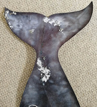
This is the tail section - made from two layers of dyed stiff non-woven interfacing. A single curved fold helps give the characteritic shape, and lots of French knots and assorted embroidery stitches create the gnarly surface.
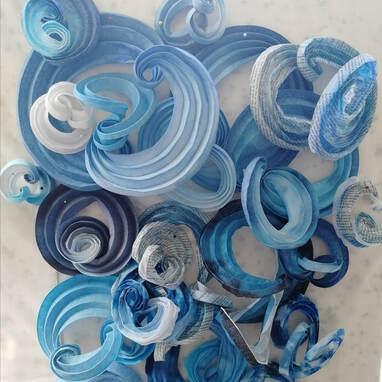
This is a close-up of the watery swirls which are made from a variety of different materials: paper, organdie, non-woven fabric and laminated organza. I have spent quite a while exploring how curved creases change the plane of a surface and this is the result. A gorgeous tangle of knots and swirls.
And finally, the net. I have watched fishermen making or repairing nets in the past and they make it look so easy.... guess what.... it isnt!!! This took 4 days of frustrated knotting, unknotting and then reknotting, but thanks to YouTube I got there in the end. The video above is a snapshot from around day 2! As this is a 3D piece it is easiest to get an idea of the whole thing with a video. It has been fun leaning how to make these short videos too. Thanks for reading. <a href="https://www.bloglovin.com/blog/21072771/?claim=b7hede7k62m">Follow my blog with Bloglovin</a> |
|






 RSS Feed
